Steven Morse personal website and research notes
Measuring Roster Skill in Fantasy Football
Written on September 15th, 2019 by Steven MorseYou’ve almost got your lineup set, except for that pesky Flex spot: do you start your RB3 who’s playing a top tier defense, or your backup TE on a string of boom weeks but who has a banged-up knee? Do you use ESPN’s projections as a tie-breaker? Or do you trust your gut?
One way to measure how good you are at making these calls is to wait until Tuesday, and compare your starting lineup’s total points to what you could have gotten if you’d had a crystal ball and picked the best possible players.
For example, let’s say you went with the RB3, he bombed and scored 3 pts, and your total was 98. The TE2 on your bench scored 15 pts, which means your total could have been 110. You were off by 12 pts from your roster’s potential and just missed the playoffs! Aaaaagh /existential screaming/. To make it worse, ESPN had the TE projected 1 pt higher than the RB, so if you had gone with its recommendation, you would have gotten the 110.
In this post we’ll deep-dive this idea with some pretty pictures. (I’m leaving out any code: it’s posted on my Github for my fellow nerds out there, and I have several other code-heavy tutorials on how to do this for your league.)
What is and what could never be
Let’s do this for a whole league for a particular week and see what we find.
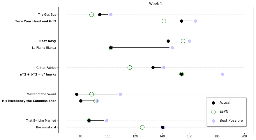
Pretty cool. The black dot is each team’s actual total, the blue dot is the best possible total given the available players. The green circle represents the real total if the team based its lineup strictly on ESPN projections.
So for example, His Excellency the Commissioner won the matchup against Master of the Sword, but if Sword had picked the best possible starters, he would have won (even if the Commish had picked optimally also).
It’s interesting that following ESPN’s projections would have helped about half the teams — but hurt the other half. In other words, it’s a coin toss. This possibly corroborates what I’ve showed before that ESPN’s projections are not very good.
Looking at trends
Let’s look at this for an entire season and see if we find any trends in our league members.
First, here’s a single team (the league winner) over the course of a season:
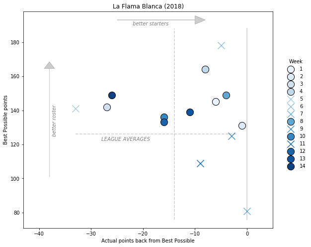
The \(y\)-axis is the best possible total, the \(x\)-axis is how far back you were from that with the actual starters. Each point is a particular week, shaded by how far along in the season it was. Circles are wins, and X’s are losses.
What’s interesting to me is how “bad” this guy was at picking starters (dots to the left), but how it didn’t matter because his players were so good he could afford it (dots toward the top).
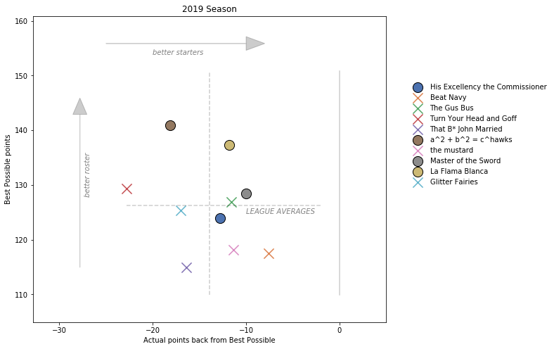
So is there any trend between your final standing and how good you are at picking lineups? Let’s take the average actual and average optimal, and plot all the teams in the league, shaded by their final Win-Loss record.
Closing thoughts
Once again, the code for these plots is posted on my Github.
This is all just descriptive statistics, but I think it helps give a brutally honest assessment on how good/bad you actually are at managing your roster, and whether you ought to give more/less weight to those projections.
Written on September 15th, 2019 by Steven Morse