Steven Morse personal website and research notes
Fourier Transforms (with Python examples)
Written on April 6th, 2024 by Steven MorseFourier transforms are, to me, an example of a fundamental concept that has endless tutorials all over the web and textbooks, but is complex (no pun intended!) enough that the learning curve to understanding how they work can seem unnecessarily steep.
So I’m going to do my best rendition of the idea, mainly as a tutorial for future-me, and also to share some Python code to help play around with these concepts as you’re getting a feel for them. My understanding is heavily based on the approach 3Blue1Brown takes in his tutorial, but hopefully I can add some insights and provide some experimentation examples to what he’s already done.
Let’s get started.
import matplotlib.pyplot as plt
import numpy as np
Review: Sound
Let’s use sound as a running metaphor for what’s going on with Fourier transforms, and since that’s one of its more frequent applications, seems appropriate.
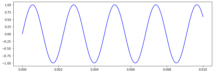
Recall that we can model a sound wave with a sine function. Put another way, if you put your ear up to a speaker blaring a perfect A440 tone, the magnitude of the pressure your eardrum experiences over time would go up and down just like a sine wave with frequency 440 Hz (i.e. 440 oscillations per second), specifically \(\sin((2\pi)\cdot 440\cdot t)\).
(Pedantic aside: recall that \(\sin(t)\) starts at 0 when \(t=0\), and makes one full up-down oscillation by \(t=2\pi\). So if we instead do \(\sin(2\pi t)\), we rescale that period to 1 – try checking \(t=0, 1/2, 1\). Similarly, \(\sin(4\pi t)\) rescales to \(2\pi/4\pi = 0.5\), so we’re making 2 oscillations per second. It’s worth working through this connection between frequency and period (\(f=1/T\)) and angular frequency (\(\omega = 2\pi f\)) yourself – we won’t do anymore here since we haven’t even gotten started!)
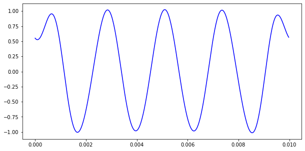
Here’s the first few oscillations of the A440 tone:
fig, ax = plt.subplots(1,1, figsize=(12,4))
ts = np.linspace(0, 0.01, 500)
ax.plot(ts, np.sin(2*np.pi*440*ts), 'b-')
plt.show()
If you combine sound waves, for example by playing several notes at the same time, their magnitudes sum to create a new wave that hits your ear. Here’s three individual simple sine waves (in blue), and their sum (in black).
fig, axs = plt.subplots(4, 1, sharex=True, figsize=(12,6))

ss = 1000
ts = np.linspace(0, 10, ss)

ys = np.zeros((3, ss))
ys[0,:] = np.sin(ts)
ys[1,:] = np.sin(1.5 * ts)
ys[2,:] = 0.6 * np.sin(4 * ts)

for k, ax in enumerate(axs[:3]):
    ax.plot(ts, ys[k,:], 'b-')

axs[-1].plot(ts, np.sum(ys, axis=0), 'k-')

plt.tight_layout()
plt.show()
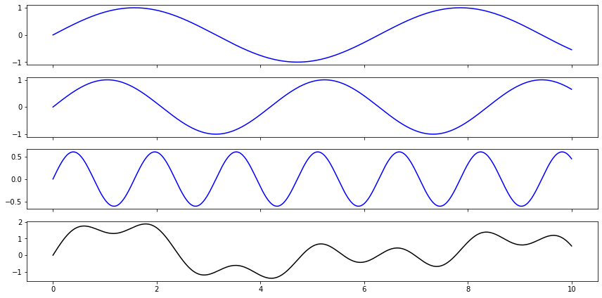
Looking at just the final curve, in black, you could almost imagine being able to pluck out the original three independent contributing curves. There’s a wiggly one, and then there must be one with greater magnitude and longer period, but there’s some other unclear intereference …
In fact, it’s possible to extract the contributing parts precisely, from the combined curve, using Fourier transforms. A lot of introductions make allusions to unmixing paint, or uncombining a smoothie.
The technique is so elegant, and the context of trigonometric curves so fundamental, that Fourier analysis shows up all over mathematics and physics, not just in sound waves. Let’s take a look at how it works.
Idea 1: “Winding frequencies”
Consider a fixed periodic function \(g(t)\) with frequency \(f\) (let’s say in Hz, periods per second). Then consider “wrapping” it around the origin – we can implement this by considering a vector (anchored at zero) with magnitude \(g(t)\) at some angle \(2\pi wt\). By adjusting \(w\), the winding frequency, we can scale how quickly we’re winding. (For example, if we wind a function’s magnitude vector with \(w=0.5\) then the function will take two seconds to complete a full circle around the origin.)
For example, consider the function \(g(t) = 1 + \cos(2\pi \ f \ t)\), with \(f=3\). I.e., it does a complete oscillation 3 times before we hit \(t=1\).
Now let’s wrap this function in a circle around the origin using the scheme described above, with the function’s magnitude as a vector at angle \(2\pi w t\).
Consider setting \(w=1\). This means the magnitude vector will hit all three “bumps” of its frequency \(f=3\) in one complete cycle around the origin. If instead we set \(w=3\), the magnitude vector will be moving so fast it will only hit one “bump” during a complete turn.
This bears out in the graph of the wound function: very loosely speaking, if \(w\) is far from \(f\), the wound graph will look like petals or spirals, representing the bumps of the function as it slowly winds around the origin. If \(w=f\) (or close to it), the graph will just show one mass, skewed to one side, representing one bump of the function elongated over a complete cycle around the origin:
fig, axs = plt.subplot_mosaic([['top', 'top', 'top'], ['left', 'middle', 'right']],
                              constrained_layout=True,
                              figsize=(11,6))

f = 3
def g(t): return 1 + np.cos(2 * np.pi * f * t)

ts = np.linspace(0,2,100)  # go thru 2 rotations
axs['top'].plot(ts, g(ts), 'b-')

ws = np.linspace(0, 1, 500)
for w, axlabel in zip([1, 3, 5], ['left', 'middle', 'right']):
    def h_x(t): return g(t) * np.cos(2 * np.pi * w * t)
    def h_y(t): return g(t) * np.sin(2 * np.pi * w * t)
    axs[axlabel].plot(h_x(ws), h_y(ws), 'r-')
    axs[axlabel].text(1.25,1.75, f'$w={w}$')
    axs[axlabel].set(xlim=[-2,2], ylim=[-2,2])

plt.show()
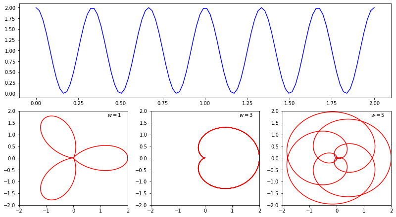
You should notice in the code, how we implemented this circular version of the function \(g(t)\) is by creating a parametric function \(h(t)\) defined:
\[h(t) = \langle g(t)\cos(2\pi w t), \ g(t)\sin(2\pi w t) \rangle\]A really clean way of representing this is using the complex plane: so \(x\) corresponds to the real part, and \(y\) corresponds to the imaginary part. And because of Euler’s identity:
\[e^{it} = \cos(t) + i\sin(t)\]we could instead think of \(h(t)\) as
\[h(t) = g(t)e^{2\pi i w t}\]And I’ll note here that, for whatever reason, by convention we compute this clockwise, so we can just flip the sign:
\[h(t) = g(t)e^{-2\pi i w t}\]Idea 2: Center of gravity
So the next key idea is that we can spot this special situation of \(w\approx f\) by looking at the center of gravity of the winding version of the function (the functions in red). (Again I owe all credit for this intuition to the 3Blue1Brown tutorial of Fourier transforms.)
Think of the center of gravity for the red functions above as the balancing point if they described the rim of a metal sheet. If we’re dead in sync, then we’ll have all the “bump” from one period spread around the origin, mostly on one side, and the center of gravity will also be off to that side. If not, we’ll have petals/spirals and the center of gravity will cancel out to be around the origin.
Let’s see what this means, and plot the center of gravity as a big green dot:
fig, axs = plt.subplots(1, 3, figsize=(12,4))

f = 3
def g(t): return 1 + np.cos(2 * np.pi * f * t)
def h_x(t, w): return g(t) * np.cos(2 * np.pi * w * t)
def h_y(t, w): return g(t) * np.sin(2 * np.pi * w * t)

ws = np.linspace(0, 1, 500)
for k, w in enumerate([1, 3, 5]):
    # average the distance to the outer curve
    x_avg = (1/500) * np.sum(h_x(ws, w))
    y_avg = (1/500) * np.sum(h_y(ws, w))

    axs[k].plot(h_x(ws, w), h_y(ws, w), 'r-', alpha=0.2)
    axs[k].scatter(x_avg, y_avg, s=75, c='g')
    axs[k].text(1.25,1.75, f'$w={w}$')
    axs[k].set(xlim=[-2,2], ylim=[-2,2])

plt.show()
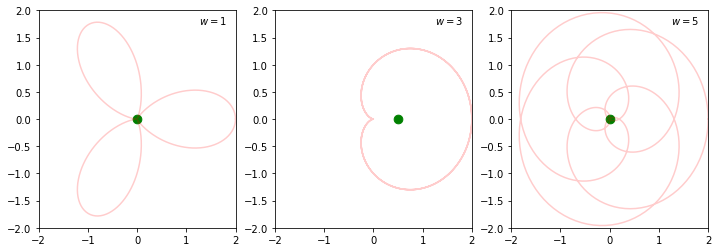
Notice that when \(w\neq f\), the dot is right on top of the origin, but when \(w=f\), we’ve spread one oscillation around the entire journey, so the dot slips off to one side.
To compute those green dots’ locations, we used the idea that the center of gravity is the average of all the magnitudes. You’ll note we approximated this with the sum
\[x_{\text{center}} \approx \frac{1}{N} \sum_{k=0}^N g(t_k) \cos(2\pi w t_k)\]represented by the code (1/500) * np.sum(h_x(ws)), and similarly for \(y\). We’d actually prefer to compute this precisely, by making the \(N\rightarrow\infty\) and taking the integral,
which is getting close to the actual Fourier transform – we’ll come back to this in a moment.
Let’s plot all these “centers of gravity” for all possible \(w\). Let’s focus on the \(x\) (or Real) component for now:
fig, axs = plt.subplots(2,1, figsize=(10,6))

f = 3
def g(t): return np.cos(2 * np.pi * f * t)
def h_x(t, w): return g(t) * np.cos(2 * np.pi * w * t)

sr = 500
ts = np.linspace(0,1,sr)
fs = g(ts)

wvals = np.linspace(0, 7, 100)
X = (1/sr) * np.array([np.sum(h_x(ts, w)) for w in wvals])

axs[0].plot(ts, fs, 'b-')
axs[0].set(xlabel='$t$')
axs[1].plot(wvals, X, 'g-')
axs[1].set(xlabel='$w$')

plt.tight_layout()
plt.show()
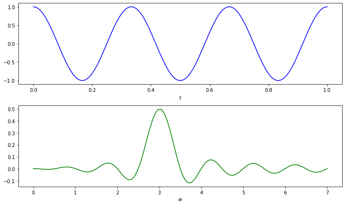
Aha! Notice the little bump at \(w=3\), corresponding to the especially rightward center of gravity there, moreso than any other place.
Idea 3: Additivity
The last key idea before we put it all together is that these properties are all additive, so that if we had an original signal consisting of three waves, their sum’s winding function would look the same as the sum of their individual winding functions.
Put another way, if we think of the “winding” plot as a transformation of a function \(g\) in the time domain (\(t\)) to a function \(\hat{g}\) in the frequency domain (\(w\)), then notice if \(g = g_1 + g_2\), then since the transformation is a summation, we must have \(\hat{g} = \hat{g}_1 + \hat{g}_2\).
This means, a bump in the plot of \(\hat{g}_1\) (capturing where \(f=w\) for \(g_1\)) and a separate bump in the plot of \(\hat{g}_2\) (capturing where \(f=w\) for \(g_2\)) will show up as distinct bumps in the plot of \(\hat{g}\).
Let’s try it:
fig, axs = plt.subplots(4,1, figsize=(10,6))

# define two waves with different freqs
f_1, f_2 = 3, 5
def g_1(t): return np.cos(2 * np.pi * f_1 * t)
def g_2(t): return np.cos(2 * np.pi * f_2 * t)

# define x-coord of winding function
def h_x(g, t, w):
    return g(t) * np.cos(2 * np.pi * w * t)

# setup time domain over 1 sec
sr = 500  # sample rate
ts = np.linspace(0,1,sr)

# compute wave values
fs_1 = g_1(ts)
fs_2 = g_2(ts)
fs = fs_1 + fs_2

# compute "center of gravity" values
wvals = np.linspace(0, 7, 100)
X = (1/sr) * np.array([
    np.sum(h_x(g_1, ts, w) + h_x(g_2, ts, w))
    for w in wvals])

axs[0].plot(ts, fs_1, 'b-')
axs[1].plot(ts, fs_2, 'b-')
axs[2].plot(ts, fs, 'k-')
axs[3].plot(wvals, X, 'g-')

plt.tight_layout()
plt.show()
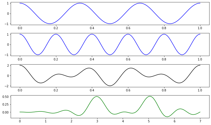
Beautiful. We have two cosine functions, with frequency 3 and 5, that merge into a the funky looking chord in the third plot, and then by computing the “center of gravity” across various frequencies, we see 3 and 5 emerge as bumps in the bottom plot in the frequency domain.
Cleaning things up
The “winding function” we’ve been referencing is a bit of a made-up interim idea. Really what we can define is a function \(g(t)\) and its Fourier transform \(\hat{g}(w)\),
\[\hat{g}(w) = \int_T g(t)\left(\cos(2\pi w t) + i\sin(2\pi w t) \right) dt = \int_T g(t)e^{-2\pi i w t} dt\]We should also mention, what we’ve been doing in the Python code so far is dealing with discrete, sampled representations of continuous functions, so not really a function \(g(t)\) but more a sequence \(x_t\), resulting in a transformed sequence \(\hat{x}_w\), with
\[\hat{x}_w = \sum_{t=0}^T x_t \cdot e^{-2\pi i (w/T) t}\]which is called the discrete Fourier transform (DFT).
Lastly, our brute-force method of computing this transform has been (hopefully) didactic but (unfortunately) very inefficient. There are several very efficient algorithms for computing the DFT, known as the fast Fourier transform (FFT).
These are also implemented in Python, in various libraries, so instead of doing nasty np.sum routines we can invoke the power of fft:
from scipy.fft import rfft, rfftfreq
(We’ve actually imported rfft here, whose use case is when your input is purely real and not complex. Although we’ve been discussing our transform in the complex domain, with real (cosine) and imaginary (sine) parts, our input function you’ll notice has been real, so it’s clearer and more efficient to use this rfft module.)
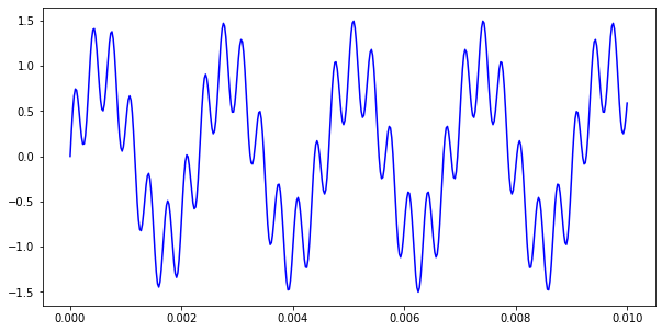
Example: filtering noise
Let’s set up a wave at a nice clean A440Hz tone, with some lower-volume but high-pitched noise added on top. We’ll plot just the first few waves of it so you can see the additive effect:
fig, ax = plt.subplots(1,1, figsize=(10,5))

def a440(t): return np.sin(2*np.pi*440*t)
def noise(t): return 0.5 * np.sin(2*np.pi*3000*t)

SAMPLE_RATE = 44100 # samples per sec (Hz)
DURATION = 0.01
N = int(SAMPLE_RATE * DURATION)

ts = np.linspace(0, DURATION, N)
ys = a440(ts) + noise(ts)

ax.plot(ts, ys, 'b-')

plt.show()
Now the idea is to transform this to the frequency domain, and see the two frequences (440 and 3000) pop out clearly.
# compute (real) FFT
yf = rfft(ys)

# get x coords (in freq domain) corresponding to yf
xf = rfftfreq(N, 1 / SAMPLE_RATE)

fig, ax = plt.subplots(1,1, figsize=(10,5))

# yf is complex valued so we just take the absolute value (magnitude)
ax.plot(xf, np.abs(yf))
plt.show()
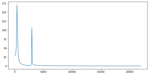
There they are! A couple things to point out here:
-
The FFT returns a complex-valued list (think back to the center of gravity intuition, where we have an \(x\) and \(y\) coordinate for each \(w\)). One way to handle this is to only deal with the \(x\)-coordinate (real coord) as we did earlier. Here, instead, we’ve computed the magnitude of the complex number, that is for \(z = a+ib\), the magnitude \(\vert z\vert =\sqrt{a^2+b^2}\), which we hope captures the value better in some sense.
-
Notice the FFT returns a maximum frequency of 20,000 something Hz – 22050 Hz to be exact, which happens to be half of our sampling frequency of 44100 Hz. This value is called the Nyquist frequency (or folding frequency).
Filtering out noise and the Inverse Fourier Transform
If you thought we were being fast and loose before, wait until you see this last section!
Let’s quickly get a feel for the concept of filtering noise from a signal. First, looking at the transform of the signal in the frequency domain, we see the unwanted frequency around 3000 Hz. We can manually flatten this portion of the transform, and then do an inverse transform back to the time domain to get a listenable signal.
Flattening the transform is a simple enough idea: we could either “zero out” all frequencies above a certain number, or target the values around the observed anomaly, or use more sophisticated techniques. We’ll do the “zero out” approach in a moment.
The inverse transform idea should give you a little more pause. How exactly can we go from frequency domain back to time domain?
Simply enough, we take each frequency \(w\) and turn it back into a wave via \(e^{2\pi i w t}\), scaling by the transform value \(\hat{g}(w)\), and then adding all those results together. In the continuous limit, this looks like
\[g(t) = \int_w \hat{g}(w)\cdot e^{2\pi i w t} dw\]We won’t explore this in as much depth, and just sort of cut to the proof-of-concept-punchline, but it’s worth playing with the brute-force, manual, discrete version of this idea like we did before to build up the forward transform.
For now, we’ll use the irfft module and see what we get:
from scipy.fft import irfft
# get array index where 1000 Hz starts
pts_per_freq = len(xf) / (SAMPLE_RATE/2)
ceil_freq = int(1000 * pts_per_freq)

# zero out everything above 1000 Hz
yf_mod = yf.copy()
yf_mod[ceil_freq:] = 0

# compute inverse FT
ys_mod = irfft(yf_mod)

fig, ax = plt.subplots(1,1, figsize=(10,5))
ax.plot(ts[:-1], ys_mod, 'b-')

plt.show()
And we’re back to a nice clean A440 tone! We’re skipping a lot of messy details like normalizing, but the goal here is to get a feel for what’s going on.
That’s it for today. For more on this, there’s quite a few tutorials around the web: both for Python, the math, and the math in a more applied context. Hopefully my version of events helped and gave you some code to play around with to explore the ideas. Thanks for reading!
Written on April 6th, 2024 by Steven Morse