Steven Morse personal website and research notes
Principal Components Analysis (in Python)
Written on January 8th, 2023 by Steven MorsePrincipal Components Analysis is a well-worn tool in statistics and machine learning, which, based on the number of articles and Stack Overflow posts, is a little misunderstood. I attribute this to: PCA is a very fundamental concept, dealing with fundamental things like linear transformations and covariance, so you can demonstrate it multiple ways, and I think all those different definitions and approaches get all muddled together and confused, as a first-time learner.
I’ll explore PCA in the order and structure that I would want to hear it. This post is mainly for future me, when I’ve forgotten some detail and want to refresh myself. Hopefully it’s useful to you, too!
First, a very visual intuition. PCA is a way to project a high-dimensional dataset into a lower dimension, in a way that captures the most information. I’m using “information” extremely loosely here. Better to say, “captures the most variance,” but we’ll come back to that.
For now, consider an example of a 3-dimensional dataset and its projection into 2-d.
import matplotlib.pyplot as plt
import numpy as np
import scipy.stats
# create data
N = 20
C = np.array([[1,0,0], [0,1,0.7], [0,0.7,1]])
data = np.random.multivariate_normal([0,0,0], C, size=N)

# compute PCA
U, S, VT = np.linalg.svd(data, full_matrices=False)
Z = np.dot(data, VT.T)
fig = plt.figure(figsize=(12,5))

# create plotting grid
X, Y = np.mgrid[-2.5:2.5:.1, -2.5:2.5:.1]
a,b,c = VT[2] # this is the norm to our PC surface

# 3d plot of data and surface
ax = fig.add_subplot(1,2,1, projection='3d')
ax.scatter(data[:,0], data[:,1], data[:,2], s=60, marker='o')
ax.plot_surface(X, Y, -(a/c)*X -(b/c)*Y, cmap='Greys', cstride=2, rstride=2)

# plot projection lines from point to surface
for Xi in data:
    pX = np.dot(np.dot(Xi, VT[:2,:].T), VT[:2,:])
    ax.plot3D([Xi[0], pX[0]], [Xi[1], pX[1]], [Xi[2], pX[2]], 'k', alpha=0.7)
ax.set(xlim=[-2.5,2.5], ylim=[-2.5,2.5], zlim=[-2.5,2.5])
ax.view_init(elev=15, azim=180)
ax.axis('off')

# 2d plot
ax = fig.add_subplot(1,2,2)
ax.scatter(Z[:,0], Z[:,1], s=80, c='b', alpha=0.8)
ax.set(xlim=[-2.5,2.5], ylim=[-2.5,2.5])

plt.show()
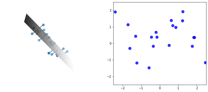
There is an enormous amount going on in this code, and this plot, most of which we’ll explore in detail later in this post. But absorb the gist: we have a cloud of data, that seems to be slight perturbations off some “invisible” hyperplane cutting through the cloud – we can project each datapoint onto this hyperplane, giving a 2-d expression of the data which, it seems, captures the vast majority of the information (or variance).
PCA gives a simple and principled way to determine this hyperplane and conduct the projection, and it expands to any dimension. For example, we could further project the above 2-d onto a 1-d line (although we would get a big drop in explained variance). Or we could project a 1,000-dimensional dataset (like, say, images) into 10 dimensions (for example as a way of compression) or 2 dimensions (to visualize the dataset in 2-d).
Getting into it
Here’s the anchorpoint phrase I find most useful when understanding PCA:
PCA is a projection of the data onto the eigenvectors of the data’s covariance matrix.
Specifically, it’s a projection of \(X\) onto the first \(K\) eigenvectors of the covariance matrix \(C=X^TX/(N-1)\). This results in the projected data being
- the best low rank approximation of the original data, and
- the projection which maximizes the explained variance.
This anchorpoint captures the intuition for me. Now let’s unpack how and why it works.
Projection onto eigenvectors
Consider a \(N\times D\) matrix \(X\), with \(N>D\). Let’s adjust each feature (column) to be zero mean (we can always adjust back later if we want) – then the (empirical) covariance matrix is simply \(C=(X^TX)/(N-1)\). (Btw if you transpose \(X\), so each column is a datapoint, the covariance matrix is \(XX^T/(N-1)\), instead, which you’ll sometimes confusingly encounter in references.)
We can decompose \(X\) as \(X=USV^T\) using a singular value decomposition (SVD).
Begin refresher sidenote. SVD is a very common procedure with many well-known efficient algorithms. The “full” SVD gives a \(N\times N\) orthonormal matrix \(U\) where columns are the left singular vectors of \(X\), an \(N\times D\) matrix \(S\) with singular values \(\sigma_i\) along the upper \(D\times D\) diagonal, and a \(N\times D\) orthonormal matrix \(V\) where columns are the right singular vectors of \(X\). Much of \(U\) and \(S\) are empty, so we typically consider the “thin” or “compact” or “economy” SVD, with \(U\) now \(N\times D\), \(S\) now \(D\times D\), and \(V\) unchanged. (Btw recall \(U^TU = I\) for an orthonormal matrix.) End refresher sidenote.
Applying the SVD to the covariance matrix,
\[X^T X = (USV^T)^T (USV^T) = VS^T U^T USV^T = VS^T SV^T = VS^2 V^T\]and therefore, right-multiplying by \(V\),
\[\begin{align*} (X^TX)V &= VS^2 \\ CV &= VS^2/(N-1) \end{align*}\]which reveals the columns of \(V\) as the eigenvectors of \(X^TX\), and the diagonal of \(S^2\) as the eigenvalues of \(X^TX\). (Specifically, \(\lambda_i = \sigma_i^2\), and note the eigenvalues \(\tilde{\lambda}\) of the covariance matrix \(C\) are then \(\tilde{\lambda}_i = \sigma_i^2 / (n-1)\).)
Begin refresher sidenote. Projections. Recall the dot product \(\mathbf{a}\cdot\hat{\mathbf{u}}\) gives the scalar projection of \(\mathbf{a}\) onto the unit vector \(\hat{\mathbf{u}}\) – or said a different way, the coordinates of \(\mathbf{a}\) along basis vector \(\hat{\mathbf{u}}\). If we have several of these vectors, \(\mathbf{a}_i\), and we collect them as the rows of matrix \(A\), then \(A\hat{\mathbf{u}}\) gives the coordinates in \(\hat{\mathbf{u}}\) of each one. If we have a set of orthonormal (orthogonal \(\hat{\mathbf{u}}_i\cdot\hat{\mathbf{u}}_j=0\) and normal \(\vert\vert \hat{\mathbf{u}}_i\vert\vert =1\)) basis vectors, organized as columns of the matrix \(U\), we can project the entire matrix \(A\) into this basis with \(AU\). End refresher sidenote.
Note the eigenvectors \(V\) form an orthonormal basis. If we wanted, we could project \(X\) into this space with \(Z=XV\). (Or equivalently, \(Z=XV=(USV^T)V=US\).) Now the \(i\)-th row of \(Z\) is the \(i\)-th datapoint of \(X\), but in \(L\) dimensional principal component space. Each column of \(Z\), is the coordinates of each data point in a dimension of the new PC space.
Example
Let’s create a toy dataset with \(D=2\), and compute the PCA and projection \(Z = XV\) onto the eigenvectors of its covariance (onto the “principal components”). For data, we’ll draw samples from a highly correlated Gaussian.
# create data from a positively correlated 2-d gaussian
N = 10
C_actual = np.array([[1, 0.8], [0.8, 1]])
X = np.random.multivariate_normal([0,0], C_actual, size=N)

# mean center columns
X -= X.mean(axis=0)[np.newaxis, :]

# compute PCA from (thin) SVD
U, S, VT = np.linalg.svd(X, full_matrices=False)
V = VT.T

# compute principal components
Z = np.dot(X, V)
Now let’s plot the data, the Gaussian corresponding to the empirical covariance, and the projection \(Z=XV\).
fig, axs = plt.subplots(1,3, figsize=(13,4))

# spaces for plotting
xs = np.linspace(-3,3,5)
wx, wy = np.mgrid[-3:3:.1, -3:3:.1]
z = np.dstack((wx, wy))

# raw data scatter
axs[0].scatter(X[:,0], X[:,1], s=50, c='b', alpha=0.7)

# draw eigenvectors (scale by sigma/2 for viz)
for s, v in zip(S, VT):
    axs[0].arrow(0,0, (s/2) * v[0], (s/2) * v[1], head_width=0.1, head_length=0.2, fc='k')
axs[0].set(title='Data', xlabel='$x_1$', ylabel='$x_2$')

# show projection onto PC 1
for xi in X:
    px, py = np.dot(xi, VT[0]) * VT[0]
    xx, yy = xi
    axs[0].arrow(xx, yy, px - xx, py - yy, alpha=0.5)
axs[0].plot(xs, xs * (VT[0,1] / VT[0,0]), 'k--', alpha=0.5)

# show 2-d gaussian corresponding to the empirical covariance
rv = scipy.stats.multivariate_normal([0, 0], np.dot(X.T, X) / (N-1))
axs[0].contour(wx, wy, rv.pdf(z), levels=10,
               colors='k', linewidths=0.5, alpha=0.2)

# plot projection onto both PCs
axs[1].scatter(Z[:,0], Z[:,1], s=50, c='b', alpha=0.7)

# draw eigenvectors (unscaled)
for vv in np.dot(VT, VT.T):
    axs[1].arrow(0,0, vv[0], vv[1], head_width=0.1, head_length=0.2, fc='k')
axs[1].set(title='Projection onto PC 1 and 2', xlabel='PC 1', ylabel='PC 2')

# plot projection onto 1st PC
axs[2].scatter(Z[:,0], [0]*Z.shape[0], c='b', s=50, alpha=0.7)
axs[2].plot(xs, xs * 0, 'k--', alpha=0.2)
axs[2].get_yaxis().set_visible(False)
axs[2].set(title='Projection onto PC 1', xlabel='PC 1')

for ax in axs.ravel():
    ax.set(xlim=[-3,3], ylim=[-3,3])
plt.show()
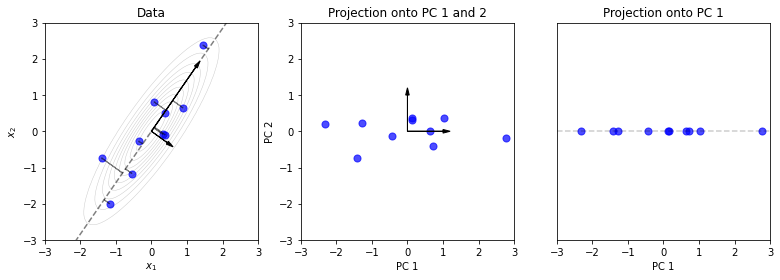
The projection \(Z=XV\) is effectively a rotation and slight rescaling. Note here that the eigenvector corresponding to the largest eigenvalue, is the one that explains most of the variance. And fortunately, SVD places these eigenvectors in \(V\) in decreasing order by their eigenvalues (from the singular values of \(X\)).
In the third plot, we’ve projected the data onto this one eigenvector, giving the 1st Principal Component. This reduces the dimension of the data from 2-d to 1-d. In the next sections, we’ll see that this projection is not arbitrary and carries several nice properties.
Projection minimizes reconstruction error
Using the connection to SVD, we can say more.
Recall that you can use a “truncated SVD” to approximate \(X\). You take the first \(K\) columns of \(U\) and \(V\), call it \(U_K\) and \(V_K\), the top left \(K\times K\) corner of \(S\), call it \(S_K\), and you get \(X\approx X_K = U_K S_K V_K^T\).
In fact, we note that this approximation is of rank \(K\). We can prove that it is the “best” approximation of rank \(K\) of matrix \(X\), in the sense that it minimizes the reconstruction error. First note we can reconstruct \(X\), from \(Z\), by computing \(ZV^T = XVV^T = X\). Now, one can show that \(Z_K\) is what minimizes the “distance” (Frobenius norm) between the actual \(X\) and its low-rank reconstruction \(Z_K V_K^T\):
\[\hat{Z} = \text{arg}\max_Z \vert\vert X - Z_K V_K^T \vert |\]Pedantic sidenote: recall \(X\) is \(N\times D\), \(Z\) is \(N\times D\), \(V\) is \(D\times D\), and \(Z_K\) is the \(N\times K\) matrix resulting from multiplying \(X\) by \(V_K\), the \(D\times K\) slice of \(V\). Therefore, \(Z_K V_K^T\) is \(N\times D\), which is the same shape as \(X\).
Example
Let’s take our data from before, that we projected into 1-dimension, onto PC 1, and try to reconstruct \(X\). How “bad” is it?
fig, ax = plt.subplots(1,1, figsize=(6,6))

# compute "reconstruction"
XK = np.dot(Z[:,0].reshape((-1,1)), VT[0].reshape((1,-1)))

# plot original and reconstructed data
ax.scatter(X[:,0], X[:,1], s=50, c='b', alpha=0.7, label='Original')
ax.scatter(XK[:,0], XK[:,1], s=50, c='c', alpha=0.4, label='Reconstructed')

# visualize change
for x, xk in zip(X, XK):
    ax.arrow(x[0], x[1], xk[0]-x[0], xk[1]-x[1], alpha=0.2)

ax.legend()
ax.set(xlim=[-2.5,2.5], ylim=[-2.5,2.5])
plt.show()
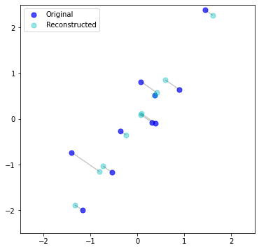
It’s literally just the projection of the original data, onto the 1st PC, in the original space. In a sense – duh. But in another sense – cool. Regardless, important to remember the “reconstruction” is the projection (shadow) but in the original dimensional space.
Example
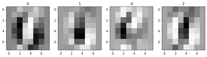
Let’s try this on a much higher dimensional dataset. For example, a dataset of images. The classic MNIST dataset is a set of scans of handwritten digits. sklearn provides an abridged version, with 1797 samples of \(8\times 8\) pixels. We can just “flatten” each image, and so we have an \(X\) with \(1797\times 64\). Each pixel (feature) is a number 0 to 1 capturing the grayscale color value. Let’s load it and take a look at a few.
Sidenote: Since we’re involving sklearn, worth noting we can use sklearn.decomposition.PCA to compute PCA, instead of doing it “manually” with np.linalg.svd. However, note that sklearn flips the sign of the component matrix so that the largest loading is positive (check out the source). The SVD is not unique, so this is sklearn’s way of standardizing the output. To avoid confusion, and as a weird flex, I’ll keep using SVD, but up to a sign flip, they yield the same result.
import sklearn.datasets
digits = sklearn.datasets.load_digits()
X = digits.data
fig, axs = plt.subplots(1,4, figsize=(12,3))
for ax, ix in zip(axs, np.random.choice(X.shape[0], 4)):
    ax.imshow(X[ix,:].reshape((8,8)), cmap='Greys')
    ax.set(title=digits.target[ix])
plt.show()
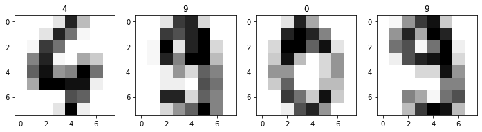
Those are some blurry images, lol. Please note the actual, original MNIST dataset is much higher resolution. Anyway, let’s compute the SVD, and look at how quickly the variation contributions fall off for each successive principal component:
# remember, we should zero-mean the data
# (in order for the math to make sense)
X -= X.mean(axis=0)[np.newaxis, :]

U, S, VT = np.linalg.svd(X)
V = VT.T
fig, ax = plt.subplots(1,1, figsize=(7,7))
ax.plot(range(len(S)), np.cumsum(S) / np.sum(S), 'k-')
ax.set(xlabel='PC', ylabel='Total explained variation', xlim=[-1,65])
plt.show()
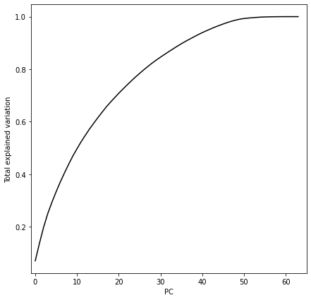
There’s no clear inflection point in this chart – we capture quite a bit of information with the first 5-10 principal components, but there’s not a clear point where we have diminishing returns. So let’s try the first two PCs, so we can visualize in 2-d. We’ll color each point based on its label.
fig, ax = plt.subplots(1,1, figsize=(8,8))

# compute projection into 2-d
ZK = np.dot(X, V[:,:2])

# plot
c_map = plt.cm.get_cmap('jet', 10)
ax.scatter(ZK[:,0], ZK[:,1], c=digits.target, s=30, cmap=c_map, alpha=0.5)

plt.show()
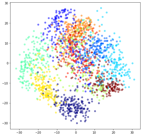
This is cool – we can see the 10 digits start to separate (cluster) in 2-dimensional PC space. It may be tempting to do clustering or classification in PC space, but this is not necessarily good practice, since the extra variation you’re throwing away would be helpful to the clustering/classification model. Usually better to give the model everything, and regularize (this is also a topic for another post).
By the way, watch what happens when you “reconstruct” some of these digits from their 2-d projection:
fig, axs = plt.subplots(1,4, figsize=(12,3))
XK = np.dot(ZK, V[:,:2].T)
for ax, ix in zip(axs, np.random.choice(XK.shape[0], 4)):
    ax.imshow(XK[ix,:].reshape((8,8)), cmap='Greys')
    ax.set(title=digits.target[ix])
plt.show()
Remarkable to me that from these unintelligible blurs, there’s enough aggregate structure to see the patterns we observe in 2-d.
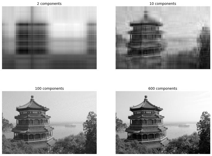
Example
Another classic use of PCA is to lower the dimensionality (kinda like resolution) of a single image. This is very similar in spirit to the previous example, but now our data \(X\) is a single image, so if you had a \(400\times 600\) pixel image, you have a \(400\times 600\) data matrix \(X\). Weirdly, we can think of a column of pixels as a feature. (Does this change things if we transpose the image?)
# load sample image
img = sklearn.datasets.load_sample_image('china.jpg')

# image comes with RBG layers -- collapse to single Grayscale layer
img_agg = img.sum(axis=2)
img = img_agg / img_agg.max()

print(img.shape)

fig, ax = plt.subplots(1,1, figsize=(9,9))
ax.imshow(img, cmap=plt.cm.gray)
ax.axis('off')
plt.show()

# compute SVD
U, S, VT = np.linalg.svd(img)

# compute PCA
Z = np.dot(img, VT.T)

fig, axs = plt.subplots(2,2, figsize=(13,10))

for ax,k in zip(axs.ravel(), [2, 10, 100, 600]):
    ax.imshow(np.dot(Z[:,:k], VT[:k,:]), cmap=plt.cm.gray)
    ax.set(title=f'{k} components')
    ax.axis('off')
plt.show()
Projection maximizes explained variance
So far we haven’t made any explicit probabilistic arguments about this projection, \(Z\) or \(Z_K\). We’ve been recklessly assuming the projection which minimizes the reconstruction error, maximizes the explained variance.
It is true, and the proof is detailed but straightforward, a nice one is in Murphy, that I won’t rehash here.
Fortunately, it’s an intuitive idea: it makes sense that the low dimensional version of the data which permits the least lossy reconstruction, is the one that captures all the biggest changes (variation). So therefore, this best-projection must capture the most variance. Also, since the basis we’re projecting onto is spanned by the eigenvectors of the covariance, in order by their eigenvalues’ magnitude, it seems intuitive that is going to give capture the most variance possible.
Next steps
Classical PCA is part of a family of latent (linear) models, where there is some “latent” (i.e. hidden) variable that we observe via other variables. Other models in this realm are mixture models, and, closer to PCA, techniques like factor analysis, or probabilistic PCA.
Classical PCA is limited in that it projects the data onto a linear subspace. Similar to what we saw in linear regression, instead of fitting curvy lines/spaces, we can transform our data so that a linear model does explain it well, fit in the transformed space, and then transform back as needed. This approach applies to PCA. And as in regression, it leads to kernel methods – “kernel PCA”. These methods are very powerful because we don’t need to work with the basis expansions directly at all, but instead with very flexible things called kernels.
Zooming out on this concept, there are many other ways to learn a nonlinear, lower-dimensional surface (or manifold) that provides a good representation of higher dimensional data. This family of latent models is called “nonlinear dimensionality reduction” or “manifold learning”, and includes self-organizing maps, t-SNE, locally linear embedding, and many, many others.
I think that’s enough for this post!
Written on January 8th, 2023 by Steven Morse